
Friday, 22 October 2010

Wednesday, 20 October 2010

Pictures


I photoshopped my final image to brighten the background, it is advertising the main coverline with a simple "haha!" sign. The models are laughing to tie in with the comedy and the colours are black and white to match the colour scheme.
Thursday, 14 October 2010
Bar Codes and Sizes

I then went on to look at how large i would like the bar code, i don't want it too large to taken up room and i don't want it small enough for a sales personel to find it hard top find.
Masthead Fonts


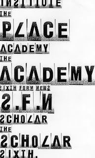

I narrowed my choice of mastheads down to these 6, trying certain mastheads with "the" before to change the effect. I am really look for a bold font to stand out to my target audience's attention.
Layout Style Ideas - (not context)

Wednesday, 13 October 2010
Main Cover Line and Cover Line Ideas

I have also created a spider diagram of cover lines to express accross my front cover.
Subscribe to:
Posts (Atom)