
Friday, 17 December 2010


Target Audience

The range of music helps interest different age groups such as the teens by the new music artist and 80's punk which spreads over a chunk of age groups. There will be collumns and features on certain fashion aspects with new and qwerky trends, this interests the male audience but is dominates by the females. There would also be features on music in nearby countrys in the EU to interest the ever growing foreign population of
Overall Summary
I want to create a magazine that avoids narrow casting to appeal to a wider range audience. It will be eclectic containing a unique range of genres creating a hybrid fusion. Due to the everchanging fashion trends which are now focusing on street couture and punk my magazine house style will follow this and will have the option to change in correlation to the fashion industry, keeping audience interest and maintaining originality and freshness.
I would pitch my magazine to IPC as they already publish fashion magazines:
· In Style
· Marie Claire
· Look
The only music magazines they publish are:
· NME (a mainstream magazine expressing new music) £2.20 per week.
· UNCUT (which is similar to Q by promoting quality music such as Paul McCartney) £4.20 per month.
This magazine would create a bridge between the two magazines as there is no other music magazine similar to mine that they publish. The price of uncut is expensive but a month of NME would cost even more, £8.80. My magazine would be a monthly edition at an affordable price of around £3.20. This puts the price of the magazine in the center of both NME and UNCUT.
Clash Double Page Spread Analysis


The main image of Iggy relates back to the front cover. The use of medium close-up has been used in this double page spread and on the front cover. His right arm is raised in this main image whereas on the front cover they're both raised. Also his focus is diagonally down wheras on the front cover it is directly look at the reader. The image is black and white which is oposite to the front cover. He is performing in this image which contrast the front cover. His iconic clothing, bare chested, continues through to the doublee page spread.
The headline "RAW POWER" is showing Iggy in a positive light. The article is about the front cover line, it mentions David Bowe also. The colour white has been used to signify purity and the red danger or warning, this shows Iggy in two different lights which the artical is about. The fact he was an iconic musician but his drug habbits where a downfall. The double underline of the wordm "POWER" emphasizes this, intensifying Iggy's reputation. The us of a white line border ties in the colour of the headline and the colour of the writing. The use of a bold, red, capital "T" draws the attention of the reader to a particular point, here being the begining of the artical. The way they have used a strencil version of the main image in the letter "A" realtes both pages and creates an asthetic symetry.
A brief introduction and a bold, state of time gives the reader a short insight into the article, so they understand the context and contents of it before reading it. The use of two colums introduces the rest of the feature pages without boring the reader.
Summary of Analysis
From analysing this double page spread i have learned how to create continuity through a magazine by relating the front cover main image and main coverline to a double page spread, and through the use of photography. Also, i have learnt how to create interesting and unique typefaces through the main image of the double page feature.
Clash Contents Page Analysis

The main image is Iggy again showing him performing. They have done this as the main feature and made his page number and title the largest to stand out to the reader and make them aware that he is the main feature. He also has the largest ??? to show his importance in the magazine.They have three separated images,all the same size, to show the double page features and make them stand out to the reader. They have also used green and pink, which is apart of the house style from the front over, to highlight more important regulars.
Th regulars and features have been clearly separated by sub heading with gold, connoting "the best". Also the fashion section is clearly shown with a bottom banner line in black to create a contrast with two separated images. They even have a "PLUS" strip to advertise more of the clash fashion.
The colours have created continuity through the house style and the golds and blacks have formalised it, also giving a splash of street couture relating to fashion trends.
The main image is of him performing again, almost eating the microphone, which shows his qwerty and weird performance side to him. The black and white image relates to the double page spread which creates continuity. He, like in the double page spread, isn't looking directly at the audience and you can barely see his eyes at all. His hair is in a different style and he is wearing a piece of arm jewelry in the shape of a snake.
Summary of Analysis
From analysing this contents page i have learned how to create emphasis on certain features opposed to others. I have also learned how to achieve an effective house style and use colours to create an impression on an aspect of the page. I have also learned how to use separated images to achieve the same quality.
Clash Front Cover Analysis

Publisher: PPA
Editor in Chief: Simon Harper
Genre: Alternative
Issue Number:49
The "a" and "s", in the mast head, appear to mirror each other which relates to the genre of the magazine. This is because the magazine is alternative, opposite to other genres, and this is what the letters are doing, the "a" is just an "s" but the opposite way around. It also relates to the banner line as Iggy and David Bowie are very similar to each other, they both had a cocaine addiction and lived together in Berlin
Iggy, in the main image, is swearing by holding his middle fingers up, the institution have made this subtle to the audience by not directing the offensive sign to the audience, this could offend readers lowering sales. This subtle gesture shows Iggy's attitude as a famous rock star would have. The subtleness could also suggest his retirement of the music industry, almost as if he isn't capable anymore or not as outrageous as he used to be by not swearing fully. They could also be interpreted as devil horns to connote his bad boy image and his devilish attitudes on stage. The use of medium close up draws our attention to his bare chest and upper torso. This is iconic of Iggy, so we instantly know it's him even though the image is centred at his chest. The simplistic background makes it easy for the audience to read the cover lines so their attention is not distracted.
In the banner line "IGGY AND THE STOOGES" is in bold, lime green and in capital letters, This is so the audience are clear about the what is the most important part of the writing, i.e not David Bowie, not death or drugs but IGGY AND THE STOOGES. The lime green creates a clash against the pink mast head and rest of the banner line which correlates with the genre and the connotations of the mast head. The institution have used a pink background on the rest of the banner line, which continues the colour in the mast head and some cover lines. The white writing creates a clear contrast so that it is easy to read. The banner line is also giving the main image anchorage.
The cover lines have a mixture of white, pink and lime green, continuing the colour scheme around the lay out creating consistency which happens to appear visually better. The font colour is plain white and they have used colour to draw attention top the specific things that will interest their target audience the most. The institution have also used a simple cross sign in pink instead of writing the word plus. This is unusual which immediately catches the readers attention to see what it is. The pink relates the cover line under the plus to the mast head making it clear that "Clash" is saying, "plus we have this!" They have also used bold fonts to subtly draw the attention of the reader to important words of the cover lines for example band names, "CYPRESS HILL". The audience are, most probably, going to like this band therefore will be drawn towards it to read about them. A simple thick pink line is vertically parallel with the boldest cover line to make it stand out even more.
An ear is used to advertise the cheap price of the magazine making it appear affordable. The choice of lime green is appropriate as there isn't as much of the colour used compared to the pink and white so it has prevented it from being lost. The strap line across the top of the magazine is also making the magazine seem worth its money by advertising free music to download, this again is encouraging readers to buy the magazine even more.
The bar code is found in the bottom, right hand corner as when magazines are stacked, this part is hidden behind others. It would waste advertising space to be portrayed in the left third. There is only a monthly edition. The website address is also found under the bar code, www.clashmusic.com. The price and issue number are written outside the bar code which looks better than inside like in Q and KERRANG magazine.
Summary of Analysis
From analysing this magazine i have learned how to create colour schemes in relation to the ideology of the masthead and genre. I have also learned, through the use of colour, how to make certain elements of the layout stand out amongst the rest. I have also learned how signs and symbols can be used in a main image to convey a certain attitude or message to an audience. Finally, i have found out how to make a product appear cheap and worth the money through the use of strap lines and ears.
Kerrang Double Page Spread Analysis

They have amiguously used the quote as a pull quote and to appear like a masthead. The use of ranged font size creates the illlusion of collaged newsprint. This style was used for death threats and black mail and the fact she is talking about being an "attention seeker" could suggest emphasis of this factor. The contrasting black and white also complement this idea and continues Lilly Allan's punk style accross the double page. The drop cap used in the article appears to be a strip of the collage continuing this style even further.
The main image is a medium close-up, we can can see Lilly Allan in a tartan shirt with her sleeves rolled up to 3/4 and her hair short black with dark eye make-up. This conotes punk and her hands on her hips shows hidden attitude. Her head is turned towards the quote which makes it look like she is saying it at that point.
There are 4 equal sized columns on the bottom left page which covers left to right. The writing is ordered to make it easily readable for the audience. The bold, red words are to link the colours of Lilly's shirt on the right to the left page, creating continuity and a clear house style. A small introduction is above the article to show the audience what the article is about before they read it.
Summary of Anlysis
From analysing this double page spread i have leared how to show hidden meaning in a picture and how to visually lin a main image to a oull quote. I have also learned that a pull quote can be doubled as a masthead. Finally, i have learned how to use interesting fonts to create hidden messages and continue house style and theme.
Kerrang Contents Page Analysis

The images have been laid out conventionally in a grid-like format. The main feature owns the largest image to make it easier for the audience to locate and to reinforce the importance of the article. The three horizontally laid pictures are of the same shot size, medium shot, which is conventional. The main image and "the king blues" image are both close-ups and the final image is a medium close-up. The range of shot sizes also interests the reader.The geometric shaped pictures match the shapes of the outlined headings, creating an overall aesthetically pleasing page.
The page numbers are the same colour scheme as the masthead but have been inverted to separate masthead, text and numbers. This is so the audience arn't confused and the writing is clear. They're all the same font size which is surprising as the main features generally have a larger number than the rest. For each picture and page number there is a caption vaguely explaining its content.
The institution have put a letter from the editor in the top left corner which is conventional to have on a contents page.They have also included a small image of the front cover to remind the audience of the magazines content and link to what the editor is saying.They have also chosen to include a quote from an artists referring to another band which is the first i have seen on a contents page. This gives an insight into the opinions of artists this target audience are willing to read about.
Summary of Analysis
From analysing this contents page i have learnt how to appropriately use the convention of an editors letter and incorporate an image along side it. I have also learned how to invert colour schemes to create continuity without boring the reader.
Summary of Analysis
From analysing this contents page i have learnt how to appropriately use the convention of an editors letter and incorporate an image along side it. I have also learned how to invert colour schemes to create continuity without boring the reader.
Kerrang Front Cover Analysis

Publisher - Bauer
Editor in Chief - Phil Alexander
Genre - Rock
Issue Number - 4224
The masthead, "KERRANG!" is said to mean the name given to the strumming on an electrical guitar, also the noise made when performing this action on the guitar. This creates an onomatopoeic relationship between the mast head and the genre of music. The font makes the word appear smashed which is ideological of rock bands as we see them smashing their guitars and breaking equipment. The colours black and white are stereotypical colours of this genre. Rock musicians tend to wear black nail varnish, thick black eyeliner, black clothing and pale white faces which are all also associated with goths. This is representing a specific stereotype and fashion trend which appeals to a wider audience gaining more interest. The white font colour creates a strong contrast against the background making it noticeable to the reader.
The main image links with the banner line, "UNDER THE SKIN OF MATT HEAFY". This gives anchorage to the image because the main image, using medium close up, is showing him being tattooed which reflects the idea of being "under the skin". We are not only, as readers, reading about himself and his possible secrets behind the famous thrash metal band TRIVIUM, but we are being physically exposed to the visual tattooing image. This is ideological as the image is creating a lifestyle that reader's aspire to be apart of (aspirational). He is not directly looking at the reader but just to the right
The institution have continued the colour scheme of the masthead through apart of the banner line but instead of having a black background they have used a shadow around the text. This ensures that the emphasis stays more to the masthead but creates an eye catching effect with the banner line giving anchorage to the main image. They have used yellow in "under the skin" to create a connection with the main image again. The yellow in the tattoo, which is under the skin of Matt Heafy, is made more clear with this idea making the over all visual quality of the front cover more aesthetically pleasing. The black Japanese symbol through the center of the banner line hints the ethnicity of the artist but keeps it subtle due to excessive amounts of black in the house style. The boldness and size of the band name "TRIVIUM" makes the audience aware instantly that he is apart of it.
The magazine, like Q, is breaking the conventions by not advertising cover lines but has used promotional plugs instead of. These are offering free poster's inside the magazine which encourages the reader to buy the magazine, even if it is just for the free posters. They have been outlined in green which has been picked out of the tattoo again relating the main image also. The anchorage across the centre of the two images is in bold yellow font, again linking with the tattoo colour, exclaiming to the audience with exclamation mark. The green background is continuing the house style throughout.
The average audience age for KERRANG would be 18-25 year olds. The price of only £2.20 makes it affordable for students and the ideological lifestyle fits this age. You have to be 18 to have tattoos so it would be pointless targeting any age group below this. Also, at that age, people are going out drinking and having fun socialising, maybe even making mischief which is what KERRANG's image is all about.
The bar code is found in the bottom right hand corner as when magazines are stacked, this part is hidden behind others. It would waste advertising space to be portrayed in the left third. There is only a weekly edition. The website address is also found under the bar code, http://www.kerrang.com/.
The bottom banner strip advertises bands of the same genre that are wrote about inside the magazine. The yellow writing is continued in the "plus!" which is in bold font to attract the reader's attention. The red background, associated with warning and danger, helps to achieve this by grabbing the reader's focus. This is mirrored in the top banner strip but using a red background and white writing which flows with the masthead colour scheme.
Summary of Analysis
From analysing this magazine i have learned how to link colour schemes effectively with the main image and how to accumulate clever and interesting puns which correlate and create ambiguity with the main image. I have also learned the appropriate use of banner strips and plugs. Finally i have learnt how to use onomatopoeia to create an interesting mast head for my magazine.
Q Double Page Spread Analysis
Again, the main image is of Paul McCartney, creating more continuity . He is seen grabbing his hair and screaming as if frustrated. This creates ambiguity with the word run. This is because the writing explains how he hasn't stopped producing after 40 years of leaving the Beatles and how he "refuses to stand still" but also the frustration makes him seem worried as if on the run. This is also the first time we see his legs at all, this could also relate to the word "RUN" as you run with your legs. He still seems to be wearing the same clothing, the dark black jacket contrasts against the white background making him pop out of the page.
The use of two simple 3 letter words, "MAN" and "RUN" creates an effective title and combines the house style colour scheme effectively due to the simpleness. The red highlight on Paul McCartney's name adds more red so that the double page spread doesn't look too black and white. It also makes his name stand out to the reader so that they know the two pages link. tis is because it is unusual to have a clear separation between pages of a double page spread.
The bold black background makes all of the writing stand out and contrasts against the light grey background of the picture next to it. There is also two lines, one above the writing and one below to group the words together. The simple by lines are located at the bottom of the left hand page with the people in bold and the title in regular font.
Summary of Analysis
From this analysis I have learned how achieve ambiguity through the use of pun. Also how to create strong contrasts between images and backgrounds and text and backgrounds. I've found out how to highlight important phrases to tie in the colour scheme and also how to separate text from title.
Q Contents Page Analysis (D.P 6&7)
Picture Total - 10
Regulars - 10 & Q review
Features - 13
Colour scheme - Red, White & Black (Matching front cover)
The main image is of Paul McCartney which links back to the front cover. Here he is hiding behind a black wall where as on the front cover he is hiding behind his own black jacket. The repetition of his face represents how much he is dominating the magazine with a 27 page edition.
The large images show the audience that they are the double page features and attracts them to flick through and have a read. The smaller images show one double page feature and one double page regular. The image for the regular 34 shows a new artist and dedicates a whole page introducing the new artist.
The colour scheme, red, white and black has continued from the front cover to the contents to also create continuity and maintain a recognisable house style for the magazine. The black writing contrasts the white background and the dividing red lines highlight the title of each feature/regular. The use of red writing emphasises certain stories that the institution wants the audience to see.
The different sized numbers also help emphasise certain features in the magazine. Paul McCartney's issue has the biggest font, then Richard Ashcroft, the Courteeners, Malcolm McLaren and the rest all the same sized. This is to put the issues in a hyeraki of importance in acceptance to the ideology of the magazine. It is similar to a news show where they would call out the headlines in order of most important to the ideology of the news show.
the large, thick, red strap line along the top highlights the masthead, "Q Contents". The simple title makes it easier for the reader to locate and scan down. On the right and side they have decided to incorporate a small image of this issues front cover and the issue number "287". On the bottom there is the q website address asking readers to subscribe and along the left hand side there is the photography credits.
Summary of Analysis
From analysing this contents page I have learned that a contents can be two pages. I have also learned how to use large and small images in an appropriate way and the same with font size. I have also found that continuity with images and colour schemes is highly important to create an effective house style throughout. I have also found out how to subtly credit photographers and how to advertise subscriptions and website addresses.
Thursday, 11 November 2010
Q Magazine Front Cover Analysis

Publisher- Bauer
Editor in Chief- Paul Rees
Main Image Photographer- David Bailey
Genre- Covers all genres giving a comprehensive
view of the music scene of yesterdays and today.
The masthead of the magazine, entitles "Q" which could mean "Quality", it could also be interpreted as part of the phrase "Q the music", as the magazine website is http://www.qthemusic.com/. The masthead is found in the top left-hand corner of the magazine, which is conventional. The background of the masthead is red which is associated with royalty, this links with the idea of the magazine being a "quality" magazine. NME magazine uses red writing on a white background whereas Q is the opposite. This could be seen as the magazines showing direct diversity to each other as NME delivers new music, whereas Q is about music that has left a mark in the industry, i.e quality music.
The main image displays Paul McCartney through the use of a medium close up. He is a music legend, which is ideological of the genre. He is that famous the audience only need to see his eyes and his hair to recognise him. It's almost as if he walking the streets, hiding under his coat so that no one realises it's him, because he doesn't want to be mauled by a group of screaming fans. The fact that he is looking directly at the audience creates interaction with them, creating a visual direct address. The image is centred at the hand and not the conventional area which is the eyes. This because the audience don't need to be at eye-level with him to realise who he is. Also his hand is helping to hide his face even more, he is physically holding his jacket in front of his own face. David Bailey is one of, if not, the most well-known photographers in the world, and as he has photographed this image for Q it build up the idea of "quality" even more.
This magazine is breaking the conventions by not advertising cover lines on the front cover. This is because the ??? page edition of Paul McCartney's story sells the magazine itself. There is no need in clouding the focal selling point by bombarding the simplistic and effective splash with unnecessary anchorage.
The banner line is stating the superiority of the Beatles and the fact they are all music legends. The red font colour here is almost referring to the Beatles as royalty of the music industry. Also, the fact that Paul McCartney's name is written on a gold background connotes the idea that he is famous and wealthy, the best of the best as we associate these ideas with the colour. His name is written in bold, black writing to relate the text, (name of the musician), with the image itself. This is because he is wearing a black coat which directly connects the image to the black writing. They have boldly written Beatles to emphasise the and highlight the most important word, giving anchorage to the main image. The font of the banner line is significant to the ideology of the magazine, due to the simpleness. They don't need to use an attractive font to interest the audience as the quotation, and content of the magazine, is more important than the typeface.
The magazine itself provides an ideological view of a "quality" lifestyle. Readers buy into this and aspire to be in the shoes of the celebrities/musicians they are reading about. The audience for Q is the more mature, music lover. They are targeting the social class groups A & B, this is due to the high price as people in these social classes have a lot higher income than other social groups. Also, this particular audience are more accustom to relate to the aspirational lifestyle, and would find it easier to feel apart of that community of class. I believe that the gender of the reader would be male dominated as the artist displayed is male, in other issues bands such as U2 and Muse are the main image, which are all male bands. It could also be seen in the sense that i would be women dominated, as women tend to find male bands attractive and read only for that sense.
The bar code is shown in the top right hand corner with the dateline, price and website clearly stated. The price is written in a small font size and is written in bold so it isn't hard to locate, this is conventional of a music magazine front cover. There is a monthly edition as the dateline reads "June 2010".
Summary of Analysis
From analysing this front cover I have learned how to break particular conventions with an effective result. I have also learned how to use colour schemes to create oposal with other music magazines. How to connote certain massages and meanings through the main image and colour schemes, and how sometimes simplicity is the most effective splash.
Tuesday, 9 November 2010
Conventions of a Music Magazine Double Page Spread
- Main Image (dominates)
- Sperated Images
- Article (can link to front cover main image, the artist has to link with the genre of music)
- Interview
- Audience Profiles
Conventions of a Music Magazine Contents Page
- Features (special for the magazine)
- Regulars (happens in every magazine)
- Editorial (black & white/colour picture of editor in cheif with signature)
- Masthead
- Page Numbers
- General Images
Conventions of a Music Magazine Front Cover
- Main Image (normally centered at the eyes)
- Masthead (generally top left hand corner expressing the genre of the music through the name and font style etc.)
- Banner Head Line (Main cover line gives the main image anchorage)
- Cover Lines (Sell lines give an insight into the magazine)
- Tag Line (a short, sharp phrase that sums up the editorial philosophy)
- Puffs (found in the corner)
- Ears (found at the edges or corners)
- Kicker (an explanitory line for the banner headline in "quotation " marks)
- Bar Code
- Date Line
- Price
- Issue Number
- Edition (monthly, weekly etc)
L.I.A.R Interperatation of Brief
I will need to research into the following points in order to achieve and create a successful music magazine front cover, contents page and double page spread.
Language
- Camera angles
- Colour codes
- Conventions
- Layout "Splash"
- House style
- Genre
Institution
- NME, MIX MAG, Q
- Publisher (NME-IPC, Q-Bauer, MIX MAG- Developement Hell)
Ideology
- Moral Values
- Message
- Aspirational
Audience
- Age
- Gender
- Type
- Social class (A/B/C1/C2/D/E)
Representation
- Central image (representing genre of music)
- Music (representing genre of music)
- Synergy
Brief
Main Task: the front page, contents and double page spread of a new music magazine. All images and text used must be original, produced by you - minimum of four images.
Friday, 22 October 2010
Contents

The different columns would be in neat rows where it says "text here for contents..." I would also have the page numbers to direct the audience to the correct page. I continued the front cover image to the contents but with neutral expression.

Wednesday, 20 October 2010

Pictures


I photoshopped my final image to brighten the background, it is advertising the main coverline with a simple "haha!" sign. The models are laughing to tie in with the comedy and the colours are black and white to match the colour scheme.
Thursday, 14 October 2010
Bar Codes and Sizes

I then went on to look at how large i would like the bar code, i don't want it too large to taken up room and i don't want it small enough for a sales personel to find it hard top find.
Masthead Fonts


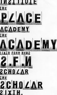

I narrowed my choice of mastheads down to these 6, trying certain mastheads with "the" before to change the effect. I am really look for a bold font to stand out to my target audience's attention.
Layout Style Ideas - (not context)

Wednesday, 13 October 2010
Main Cover Line and Cover Line Ideas

I have also created a spider diagram of cover lines to express accross my front cover.
Monday, 11 October 2010
Sell Line Ideas

I then created another mind map to accumulate ideas for the selling line of my magazine front cover.
Masthead Ideas

I created a spider diagram to stimulate some ideas to create a masthead title for my college magazine.
Thursday, 7 October 2010
Summary of Analysis
From analysing both of these college magazines, I have found they both stick to the traditional conventions. I have found out about the key rules in creating my magazine and how to create emphasis and connections between conventions. I have also found out the standered main image type of a magazine, (mid close up), and how to use it approprioately. The layout of the magazine and colour schemes to fit the audience are essential parts to consider for me to achieve a successful magazine front cover.
College Magzine Analysis (2)

The mast head reads "COLLEGE lifestyle", this tells me that the magazine isn't from a specific instutuion and is aimed at the audience of all college students in general. The date line shows us that there is only a quarterly edition. The colour of the masthead works well with the summer theme as yellow is a warm and sunny colour, it also connotes happiness, and summer is an exciting month which everyone looks forward to. The colour scheme continues through to the cover lines making the magazine look vibrant and bright.
The main image is medium close up of a young, black, college student. We can see this as the "law, buisness and society" text book he is carrying signifies this to us. He is dressed in black and white, casual clothing to keep him loooking on trend. One of the cover lines shows there is an issue inside about how to transform your casual college look into an outfit ready to party. it reads, "college couture/ campus casual to party chick", this links with the casual, college couture the model is wearing in the main image. I think the institution used black and white clothing to make him blend in with the black background and emphasise the cover lines in yellow. The picture is dim lit but keeps his face and college books light and bold. The sell line says, "your exclusive guide to everything hip, hop and happening." I think they chose to use a black model, not just to keep the magazine universal and mulit- cultural, but to tie in with the sell line. The, "hip hop" in the sell line links with hip hop music which is usually generated through the black society. Also, you generally wouldn't hear a white citizen say "hip, hop and happening", these are also words used widely in the black community. This gives an edge to the magazine and gives it a unique selling point. The model is also looking directly at the audience, this makes him appear confident and as though he is enjoying himslef, showing college in a positive light.
The bar code is in the left third with the price, clearly stated in dollars. This shows us that it is an american and canadian magazine. The other cover lines in the left third and the right handside advertise other columns in the magazine. A cover line exclaims "why we love blackberry", this brand of mobile phone has taken over now and makes the magazine look even more trendy and up to date with up and coming products and clothing.
There is a pink, splat shaped image with an advertisement to go paint balling, they have tied in the paintballing and the advertisement which makes it look asthetically better. The bright pink stand out vividly amongs the yellows, whites and blacks. They have done this to make it jump out to a reader and gain interest. Also, as it is a money maker, they have made it stand out amongst the rest of the cover lines etc.
The main cover line is about the dancehall competitons, this is again linking back with the sell line. and the hip-hop. An edition for "the ultimate spring break" is in the right hand side of the magazine, it is not in bold like the rest of the cover lines as it is a college magazine and is trying to promote college not to be out of it, but the issue will still be a main one. The web address and dancehall address are in faint writing so the information is still there, but not taking the attention of the most important parts.
Wednesday, 6 October 2010
College Magazine Analysis


Double Front Cover
The main image of the back, front cover is a girl aged around 15/16 dressed in a purple uniform made up of; a red v-neck jumper; a white shirt and a blue and red striped tie. The symbolic coded clothing connotates the idea of uniform and school. It puts her into a category/stereo type. Her hair in pinned back neatly with a child's clip making her look formal and young. She has her paper on her desk as though ready to work. To me, it looks as though the institution have purposely made the model's hand rest behind the other, and clenched her right fist to make one look reduced and the other completely hidden. I think they did this to make the girl look as though she prefers to keep herself to herself and not use her hands much to engage in practical work. This is because a cover line, in pink bold writing, says "Do boys and girls learn differently?" This could, together, make a symbolic code to show the girls view on learning. The girls view is directed toward the boy, this could be seen as the girl being angry at the confident student in the class. The pink colour codes for female, and that is what the cover line is talking about, and also the main image.
The main image of the front, front cover is of a boy also aged around 15/16, this keeps to the target audience and is also appealing to the male gender, not just the female. He is wearing the same clothing which relates the two models and shows they are a part of the same institution and belong to the same school. The model in this image appears to be smiling excitedly with his hand raised. This is a sign that we can relate to. It shows he is willing to answer a question or wanting to ask a question. In this image, it is quite the opposite to the female, the model's hands are in clear view. He appears to enjoy using his hands showing him as more of a practical learner. Again, linking to the cover lines. This contrast against the girl. He is looking straight at the audience making him look confident and enthusiastic, whereas the girl isn't. The blue colour codes for masculinity and this is what the cover line is talking about.
The top cover lines show what the columns inside are going to be about. There is even an image illustrating the last one. This interests the reader and gives them an insight into what they are buying /reading. Also the main cover line shows what the main feature is about. On the front, front cover they have used blue writing in the main cover line and pink on the other cover line, this is because the main image model is a male. On the back, front cover they have reversed this. By doing this, they have kept male and female themes strongly in both but emphasised the one which is more appropriate in each. There is also a small cover line advertising their free give away for student cook books. This makes the consumer feel like they're getting a good package and talks directly about student's maintaning the target audience. A clear white background has been used to keep the attention focussed on the main image and the main cover lines.
The "department for children, schools and families" is clearly advertised in the left third. In this particular magazine there is no model credit or bar code. I think it is because the magazine is a free edition for schools/colleges and the model is a school child.
Subscribe to:
Comments (Atom)